
Are you reading this blog post on your mobile device? If you are, this is an article for you. If you’re not, and you’re one of the rare people who still use a computer to browse the Internet, this is also an article for you. Responsive web design has become inevitable. It’s no longer an optional feature, but a mandatory part of every page. You can’t discuss website design, without discussing responsiveness.
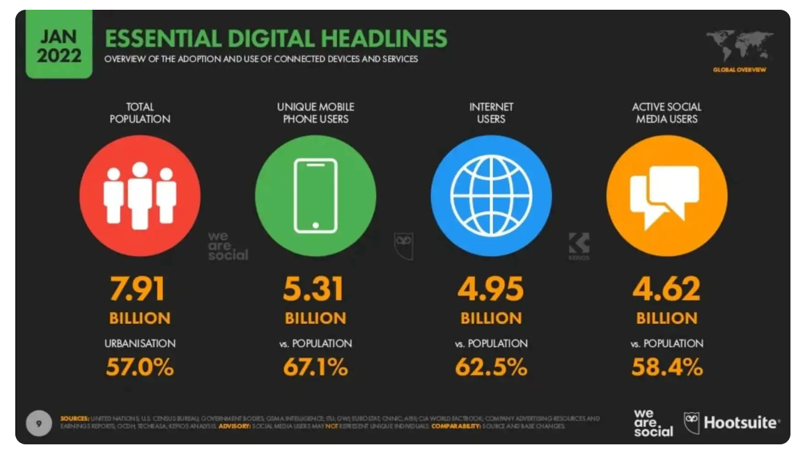
The reason for this is the fact that more and more people are switching from laptops and desktops to mobiles and tablets as their main personal devices. The COVID-19 pandemic has accelerated the digitization process and e-commerce development all around the world. There are currently 5,3 billion mobile phone users worldwide. It’s 95 millions more than in 2021.
Source: https://mobirank.pl/2022/01/27/digital-i-mobile-w-2022-roku/
A functional website is now an essential part of every business. Clients rely on the information that they can access via the Internet. If they type your company’s name in their search engine and don’t find your website, there is a high chance that they’ll get suspicious. Therefore, they won’t trust you enough to buy anything from you. Same goes for the websites that exist, but are messy and unresponsive. It just throws people off. To avoid losing potential clients due to common web design mistakes, businesses have to make sure their websites are functional and attractive on every device.
Responsiveness
Starting from the beginning – what actually is responsiveness? As the word itself suggests, it’s a website’s ability to respond to your device’s requirements. It includes both the size of displayed pages and their functionalities. A mobile version of a website should not only look good, but also be as useful as its desktop equivalent. It does not necessarily mean that your website will appear in exactly the same way on every device. It means that through different proportions and placements, it’ll be just as good-looking and functional as the full-sized desktop version. In order to achieve that, the web designer must smartly organize the contents of the website.
Google website ranking
The ultimate goal of every web design is to create a site that will reach its audience and be useful to them. In order to achieve that, it is necessary to befriend Google’s mechanisms and algorithms. There is no use of a pretty website, if it’s displayed on a 10th page of search results, because this way no one will ever find it. That brings us to the topic of Google’s Website Ranking.
Generally speaking, it’s a list of pages and their keywords, sorted in the order of search results. The higher your place in the ranking is, the more people are likely to see your page.
Now, what does it have to do with responsiveness?
Responsiveness is one of the elements that increase the quality of a website. Mobile-friendly websites are believed to have an advantage over other websites in terms of Google ranking. In order to compete with the top search results, you should invest in the responsive design.
How to check your website performance rating
- Go here: https://pagespeed.web.dev
- Enter the URL of your website.
- You are provided with a report of your website performance. Remember that the outcome may vary across different days, because it depends on many changeable factors.
If some of the 6 indicators included in the first part of the report are unclear to you, you can get to know more details by clicking on their headlines.
The second part of the report includes the analysis of your website performance. It informs you how much time it takes for the contents of your website to load or how long your user has to wait before the website responds to their action.
Your website is analyzed for both desktop and mobile devices. There is a high probability that if you improve your desktop rating, your mobile score will also increase. To achieve good scores your website must not only look nice and be functional, but also be backed up by a stable, fast domain hosting.
If all of the indicators are green, congratulations! Your website is in a great condition.
How to quickly fix your website’s responsiveness?
Proportions
In the earlier times of website design development we used to measure things in pixels. This solution is not functional anymore and rarely used by modern web designers. Instead, there are more flexible methods, such as a website grid that allows you to organize elements on your page and check how they look on different screen sizes.
With the grid you operate not on elements’ sizes, but their relations to one another. It’s a lot more flexible than dealing with pixels. It also enables responsive design, because the objects are changeable in size. You can freely manipulate their proportions so that they fit in any device, and their sizes will change automatically depending on the size of the screen.
Touchscreens
While thinking about responsive design we tend to focus on the adjustment of pages’ sizes. However, we should also consider other characteristics of mobile devices. They are usually used tactilely. Therefore, you need to make sure that all of the links and buttons on your website are big enough to click on them with your finger. Otherwise, the website will be useless to mobile viewers. All of the essential elements and strategic points of your website must be clearly visible and easily clickable on a small smartphone screen.
Themes and Templates
The template and theme of your website also have to be considered when thinking about responsive design. WordPress offers many templates and themes that support responsiveness and automatically adjust the contents of your website to the device’s screen size. One of them is Astra that you can see on our website. If you’re using a website building platform called Elementor, you can easily implement ready templates that are fully responsive.
Why is responsive design so important?
The time has come for an ultimate question that many of you might have in the back of your mind: why? Why should I care? Is this really worth the effort?
To resolve your doubts we’ve prepared a list of reasons “why”. Go through it and decide for yourself.
- Most Internet users are also mobile users, and this tendency is still going upwards. People take their phones everywhere. They scroll through the Internet while riding a bus, waiting for their doctor’s appointment, and eating their lunch. Some even take their phones to the bathroom. Having a responsive website gives you the power to reach these people numerous times a day.
- If you want to engage in e-commerce activities, mobiles will also be an essential part of your strategy, as it is mostly focused on the mobile Internet users.
- Having your website’s responsiveness figured out will also guarantee its compatibility with nonstandard device sizes. Your UX will look good no matter where it is displayed. Even in a two-window search engine view, your website will remain attractive and useful.
- Responsiveness might affect your Google scoring. The better it is, the higher and more frequently your website will appear in search results.
- It can also help you save some money. Having a responsive website means that you don’t have to create 2 websites – for desktops and for mobile devices. Due to the probable higher Google score you may also invest less in marketing and advertising, because people will visit you more often.
- Your users are provided with more pleasant experiences and are more likely to perceive you as trustworthy and professional.
- Increased sales. A responsive website can help you in more effective sales. If users like your website and enjoy browsing through it, they are more likely to make a purchase. Such a website is also available for more people to see.
Where can you learn more about responsive web design?
You can find numerous resources online. Some of them are very useful, others not so much. The safest way to learn is to rely on materials provided by big organizations. They are often very experienced and offer complex knowledge based on their know-how.
If you’re looking for a free course to get to know the basis of responsiveness, try Google’s Responsive Design. We recommend browsing through their website for more interesting courses, such as HTML and CSS coding, useful in web design.