Website design is such a fun thing to do. It’s like building a whole new little world that looks and works exactly the way we want it to. But, as much as we love creative challenges, there are certain rules that need to be followed in order for your website to not only satisfy your taste, but also be useful and welcoming to all of the people that will be visiting it. To help you avoid traps that website creators often fall into, we’ve compiled this list of 10 common website design mistakes, and how to deal with them.
Mistake no. 1: Too much text on top of photos
When it comes to website design, everyone loves good visuals. But the visual content of the website often needs to be backed up by some text. The visitor must be able to quickly understand what your page is all about. It’s also important to spark interest or curiosity in your website guests. The best way to achieve this is by combining intricate visuals with engaging textual commentary. However, you have to be careful. Placing too much text on top of your photo will make the whole thing hard to read.
If you have to place text on a photo, remember – color contrast is your biggest friend. You need to establish a great relationship with this part of your work, because it’s a natural element of every web designing process. Luckily, there are a few simple methods of achieving accurate color contrast, despite having to put a lot of text on top of a photo.
Possible solutions:
- Use homogeneous, dark backgrounds.
- Turn down the brightness of your photo (make it about 40% darker).
- Put a dark square over your photo, and place the text on top of it.
Mistake no. 2: Too many words in one verse
To make your website pleasant and easy to use, you must consider your readers’ attention span. The optimal number of words in one verse shouldn’t be higher than 12. If you cross this limit, the reader can get distracted and give up on reading.
Worth remembering:
- Stick to 9-12 words per one verse.
Mistake no. 3: Too many fonts
Fonts are pretty. We get it. And we admire their diverse styles, too! However, in website design it’s often worth following the rule: less is more. When dealing with fonts you have a perfect opportunity to apply that rule. If you get carried away and use too many different fonts, your website will look messy and will be harder to read.
Practical tips:
- Use 2-3 different fonts on your page. Don’t get too crazy.
- Choose the fonts according to their purposes – 1 for headers, 1 for your body content.
- Make sure that your chosen fonts look good together.
Mistake no. 4: Too many colors
Using too many colors is just as bad as using too many fonts. To make your website look modern and professional, you need to balance it all out with a lot of sense. Too many colors will distract your visitors. They won’t be able to focus on the actual content of your website. Too many colors can also make your website seem homemade and old-fashioned.
Our advice:
- Choose three colors for your website: main color, secondary color, and accent color. Use the 60/30/10 ratio when applying.
- Make sure that your chosen colors go well together.
- Use colors that fit the type of content, service or product your website is promoting.
Mistake no. 5: Ignoring contrast standards
We’ve already mentioned the importance of contrast, but it’s such a crucial matter that it deserves a separate place on our list.
If you don’t follow globally accepted rules of contrast, your website can not only become difficult to use. For some people it will be completely impossible to read. Contrast standards were not created to make your life as a web designer harder (even if it sometimes might feel like so). In reality it’s quite the opposite – contrast standards are made to guide designers and assist them on their journey to build the most high-quality, professional and accessible websites possible.
Okay, you know that you have to follow the rules, but how are you supposed to know every color combination there can possibly be and their relationships between each other? Well, you don’t. The Internet, as always, comes with a handful of resources that will make your job easier. To check the contrasts on your website, you can use a free program called Color Contrast Analyzer.
Look at this example, straight form one of our websites:
As we began our work on the website, we made the mistake of combining a white text with an orange background. It seemed like a nice idea. However, if you look at the screenshot below, you can see that it doesn’t align with the contrast rules.
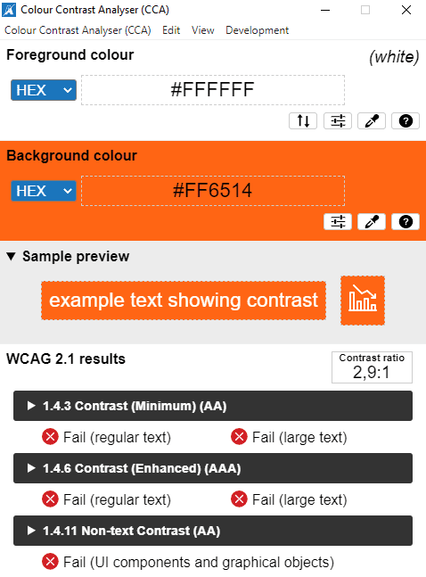
To fix this problem, we’ve changed the color of our text to black.
At first, such rules might hardly seem intuitive. However, once you get used to applying them, you will see the difference of how your web designs are perceived.
Our advice:
- Unless you’re already experienced with applying contrast standards, always check your color combinations using professional tools. There are plenty of options online (i.e. Color Contrast Analyzer).
Mistake no. 6: Inconsistent style of icons and buttons
It might seem like a small detail, and because of its lesser significance can be easily overlooked. But in reality, such details can define the whole user experience. If you use different styles of icons, the overall impression might lean towards messines and have the homemade feel to it, rather than impress users with professional design.
To avoid such an effect, look closely at your icons. Do you want them to be filled or linear? Choose your style and stick to it.
Useful resources:
Mistake no. 7: Font not matching the type of text
Font choices are crucial to your website’s readability, and its overall success. After all, what’s the use of a beautiful, functional website, if you can’t understand its content, because of poor font choices? To make sure your website is easy and pleasant to use and read, always match your font style to the type of your text.
Practical tips:
- Never use light font styles for long texts.
- In long texts stick to weight 300.
Mistake no. 8: Inaccurate body text formatting
In your body text, avoid using all caps and center alignments. It makes the text a lot harder to read, understand and remember.
Mistake no. 9: Inaccurate content placement
Remember the rule: less is more? It certainly is applicable when we talk about placing text on top of photos and images. However, sometimes, if you’re trying too hard to be minimalistic, your design might end up feeling… empty. Not only will it look unprofessional and unfinished, but can also lead to confusing your visitors. If they scroll down the page, and see nothing but an empty space, they might come to the conclusion that they’ve arrived at the end of your page, and not bother scrolling all the way down. If that happens, a big part of your content might get overlooked. And we bet you wouldn’t want that.
Possible solution:
- Always make sure that there is something visible in the range of your sight while scrolling through your pages.
- Avoid awkwardly large empty spaces in between your sections.
- Make sure to check your website responsiveness. It might look good on your laptop, but get all messed up on other devices with bigger or smaller screens. Check different options and make necessary adjustments.
Mistake no. 10: Unintuitive contact form
If you have a contact form on your website, try to look at it from your reader’s perspective. Is it clear what information should be put in what places? It might be obvious to you, since you’re the one who created it. But make sure to provide the user with all the instructions and guide them through the whole process.
Practical tips:
- Add labels to your input fields.
- Make your form validate each field as soon as the user fills it.
The most important step
We’ve guided you through 10 common website design mistakes that from now you will (hopefully) avoid. There is one final advice we want to give you, to make this post complete.
We know how hard it sometimes is to judge your own work. Especially when it involves some kind of creative process. It’s easy to get lost in your own world of concepts and ideas, without realizing that they are not clear to anyone beside yourself. That’s why, when designing a website, you need to, from time to time, step back, relax, and look at your creation through the eyes of a stranger. You can even ask someone objective to look at your website and give you some feedback on their experience as a user. Is the website intuitive? Are there any confusing parts that make the user feel lost and confused? Is it easy to read the content? Is the website clean and good-looking? What is the overall impression?
Ask these questions to yourself and to the people around you. You might find the answers that you didn’t even know you were looking for.
And last but not least – good luck!
Read more!
6 Canva Tricks That You Didn’t Know About!
How To Configure Your Google Analytics 4?
How To Breathe A New Life Into Your Blog: A Case Study Of Blog Maintenance